
Spoiler!
29 - 25

29. DPRK Victory - game generated logo automatically takes the bottom spot. Kim Jong Un, DPRK, and plenty of "victory" logos out there to upgrade

28. Los Angeles Bomb Squad - Clip art feel to it and background not removed

27. Edmonton Mounties - Looks more like a drink coaster than a logo...Mounties unreadable and would be better off without words in general

26. Seattle Windstorm/Bearded Clams - Been with us for probably close to 10 seasons and hasn't made this team his own yet, retaining the previous name and logo. Hasn't embraced the temporary Clams name with a logo either for a missed opportunity

25. Houston Alcoholics - Low on the list for the bland nature...lots of opportunity out there to upgrade with all kinds of logos associated with alcohol for the taking
24-20

24. San Diego Invaders - Clean but generic logo. Missed the boat with no alien or space invaders influence. ALTERNATE / ALTERNATE / ALTERNATE

23. Atlanta Bobcats - Looks like a red bullet train and with Ohio, Montana State, and Texas State all having solid options there's a lot left to be desired

22. Bowie Bulldogs - Words in the back make it look disjointed and the logo is outdated with the actual team using a newer more appealing version

21. Youngstown Mafia - Docked major points for not removing the white and black backgrounds. Classic look could jump with some TLC

20. Winterfell Direwolves - Direwolves are badass but this logo lets them down being black and white with very little detail. Needs an update with the direwolves featured very infrequently on a show that is no longer on the public's mind
19-15

19. MTL - "Poutine is Quebec slang for a mess" making this the perfect team name for this organization. That being said, this ranking is probably a bit generous

18. PO - Once a fierce logo, this one has lost some luster just like the franchise. An update could be in order

17. RI - Feels like a PG version of an actual logo with the wolf wearing one of those Guy Fieri hats. For as much as there's going on in the logo, it was cleanly done

16. CKV - Too much going on here with it looking more like a baseball card. Big time potential if just the bear is featured

15. OMA - Has horns and is big and red just like George's Huskers. Has brought better times since the switch was made to this logo
14-10

14. BOS - Renowned logo but lacking details and/or pizzazz. Update/refresh could turn this franchises luck around

13. CLV - Sharp new logo but until they start winning, it will remain middle of the pack

12. SHL - Had to move the order around a little bit to ensure "number twelve would shock you". Iconic logo and big fan of the yellow and black. Much like the team, was a lot cooler years ago

11. NE - Huge points for not only a spitting camel (loses some for spitting on its own team name), but also for it wearing a backwards ballcap

10. RCH - I've hated on this logo before but it grows on you. Ties in multiple elements of the nickname as well as the baseball element
9-5

9. SF - Clean, solid logo with nice detail via the different shades and a nice pop of colour to catch the eye

8. FRE - Bear logo that's battle tested and strikes fear in its opponents. Red outline is a nice touch

7. AL - The cute KBO bear is simple yet memorable. Bama's historical success helps too

6. MOO - Love the color combinations going on and the dog just looks it's sizing you up to tear you apart

5. ROS - Bashing some beaver huh? Ties all the baseball logo elements together and it's not some cute, cuddly animal
4-1

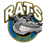
4. NJ - Nothing screams NJ like a rat, and I like to think it's got a Splinter feel to it, rocketing up the rankings

3. PHI - Big time details and fuck yeah, America!

2. MIA - Iconic TV show and the Cyan and Magenta (?) grab you. Super clean

1. WAS - Angry crab with thunder and lightning claws? Watch out! Washington's huge success has embedded this logo into his opponents' brains. Another title for Teduardo
29. DPRK Victory - game generated logo automatically takes the bottom spot. Kim Jong Un, DPRK, and plenty of "victory" logos out there to upgrade
28. Los Angeles Bomb Squad - Clip art feel to it and background not removed
27. Edmonton Mounties - Looks more like a drink coaster than a logo...Mounties unreadable and would be better off without words in general
26. Seattle Windstorm/Bearded Clams - Been with us for probably close to 10 seasons and hasn't made this team his own yet, retaining the previous name and logo. Hasn't embraced the temporary Clams name with a logo either for a missed opportunity
25. Houston Alcoholics - Low on the list for the bland nature...lots of opportunity out there to upgrade with all kinds of logos associated with alcohol for the taking
24-20
24. San Diego Invaders - Clean but generic logo. Missed the boat with no alien or space invaders influence. ALTERNATE / ALTERNATE / ALTERNATE
23. Atlanta Bobcats - Looks like a red bullet train and with Ohio, Montana State, and Texas State all having solid options there's a lot left to be desired
22. Bowie Bulldogs - Words in the back make it look disjointed and the logo is outdated with the actual team using a newer more appealing version
21. Youngstown Mafia - Docked major points for not removing the white and black backgrounds. Classic look could jump with some TLC
20. Winterfell Direwolves - Direwolves are badass but this logo lets them down being black and white with very little detail. Needs an update with the direwolves featured very infrequently on a show that is no longer on the public's mind
19-15
19. MTL - "Poutine is Quebec slang for a mess" making this the perfect team name for this organization. That being said, this ranking is probably a bit generous
18. PO - Once a fierce logo, this one has lost some luster just like the franchise. An update could be in order
17. RI - Feels like a PG version of an actual logo with the wolf wearing one of those Guy Fieri hats. For as much as there's going on in the logo, it was cleanly done
16. CKV - Too much going on here with it looking more like a baseball card. Big time potential if just the bear is featured
15. OMA - Has horns and is big and red just like George's Huskers. Has brought better times since the switch was made to this logo
14-10
14. BOS - Renowned logo but lacking details and/or pizzazz. Update/refresh could turn this franchises luck around
13. CLV - Sharp new logo but until they start winning, it will remain middle of the pack
12. SHL - Had to move the order around a little bit to ensure "number twelve would shock you". Iconic logo and big fan of the yellow and black. Much like the team, was a lot cooler years ago
11. NE - Huge points for not only a spitting camel (loses some for spitting on its own team name), but also for it wearing a backwards ballcap
10. RCH - I've hated on this logo before but it grows on you. Ties in multiple elements of the nickname as well as the baseball element
9-5
9. SF - Clean, solid logo with nice detail via the different shades and a nice pop of colour to catch the eye
8. FRE - Bear logo that's battle tested and strikes fear in its opponents. Red outline is a nice touch
7. AL - The cute KBO bear is simple yet memorable. Bama's historical success helps too
6. MOO - Love the color combinations going on and the dog just looks it's sizing you up to tear you apart
5. ROS - Bashing some beaver huh? Ties all the baseball logo elements together and it's not some cute, cuddly animal
4-1
4. NJ - Nothing screams NJ like a rat, and I like to think it's got a Splinter feel to it, rocketing up the rankings
3. PHI - Big time details and fuck yeah, America!
2. MIA - Iconic TV show and the Cyan and Magenta (?) grab you. Super clean
1. WAS - Angry crab with thunder and lightning claws? Watch out! Washington's huge success has embedded this logo into his opponents' brains. Another title for Teduardo


